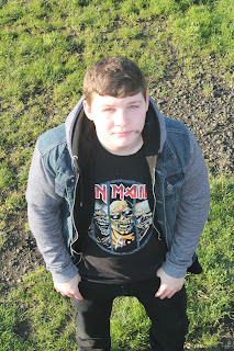
 This I like as it shows attitude as you can see all of his face, this is nice as you are really drawn to the picture and are able to focus in the picture.
Friday, 29 January 2016
top three pics for the double page spread
I like the first picture as it shows him looking across the page, this can have some effects added to it to make it look like his clothes or the sun can leak onto the other page and slowly fade into sheet music. This can add to the fact that it's a music magazine.
 This I like as it shows attitude as you can see all of his face, this is nice as you are really drawn to the picture and are able to focus in the picture.
 This I like as it shows attitude as you can see all of his face, this is nice as you are really drawn to the picture and are able to focus in the picture.
final pictures
 These are the final pictures that I have chosen for my magazine, this is the a front cover as it shows a certain edge of attitude in the facial expression as it is a stern facial expression and will capture the attention on the target audience.
 This is easy to edit and has the ability to keep the audience focused on the page and look at what comes into the article.
top three pictures for my contence page
i have chosen these pictures for my contense page I believe that they will be easy to put text on and still captures the eye of the reader.
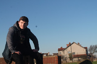
 The way he looks into the distance with the Sun shining in his face and the shadow on him adds a bad ass look to him.
 This looks nice as it shows a slight air of "all about the music" to it, it also shows the street music vibe from the street setting via the wall and the houses and that's why I like it.
 best selection for my front cover
These are my final pictures for the front cover of my magazine, this blog consists on my top three pictures for my magazine.
final photo shoot
Updated plans
I have decided the I am now not going to use any props for the magazine's pictures, I have been looking at some style models recently and have look at how they use what I call the less is more method, for example

This picture uses no props but if can still tell it's music magazine and also it still pack a punch in terms of grabbing peoples attention.
The same goes here, I want to uses this idea as it is popular via these popular magazines.

This picture uses no props but if can still tell it's music magazine and also it still pack a punch in terms of grabbing peoples attention.
The same goes here, I want to uses this idea as it is popular via these popular magazines.
Thursday, 28 January 2016
plans
Today I sat down with rhino and talked to him about the times we would go to the field, also how we were getting there and what props to use.
We chose to leave at 12:30 and this was the best time for both of us as we were both free form lesson as we were on lunch time break, we would meet up at the exit for sixth from at 12:35 and walk down to the field and arrive at 12:40 give or take around 2 or 3 minutes. And then we would take the pictures using the Gibson and Johnny Brooks guitars sitting on the wall in the sun as we checked the forecast and it showed a clear sky.
We chose to leave at 12:30 and this was the best time for both of us as we were both free form lesson as we were on lunch time break, we would meet up at the exit for sixth from at 12:35 and walk down to the field and arrive at 12:40 give or take around 2 or 3 minutes. And then we would take the pictures using the Gibson and Johnny Brooks guitars sitting on the wall in the sun as we checked the forecast and it showed a clear sky.
concept pictures
Here are all of the pictures taken from the photo shoot on Wednesday: These are all the practice shots using Brad and Danny. I took these to see what shot types I could get with the camera and what would show up well in what lighting.

I took these pictures to help with ideas I had of what shots I could achieve with the weather and lighting presented to me at the current time. These photos will not be used.

I took these pictures to help with ideas I had of what shots I could achieve with the weather and lighting presented to me at the current time. These photos will not be used.
Subscribe to:
Comments (Atom)


