
Showing posts with label Prelim Task. Show all posts
Showing posts with label Prelim Task. Show all posts
Friday, 23 October 2015
final contents page

Final front cover

I believe my editing skills need to improve a bit as i have not edited the picture of jack very well, around the edges you can see clearly where i have cropped the photo and erased parts, this will improve via me editing other pictures in my own time and this will help me improve my editing skills. also I believe i need to add more pictures into the next design as int his one it looks a little bit bland, plain and basic. I can do this by experimenting with different colours and styles of picture shots such as low angle, wide shots, extreme closeups, etc, in different lighting, to see what colours compliment certain types of shots. All in all though in believe it is a good first attempt of using photoshop.
adding the page number

Thursday, 22 October 2015
Contents new header and text designs using the effects available

 Also I have added text using the text tool and have added an effect to it called a shadow effect to help it stand out and also make it easier to read and understand
 Contents page hedder

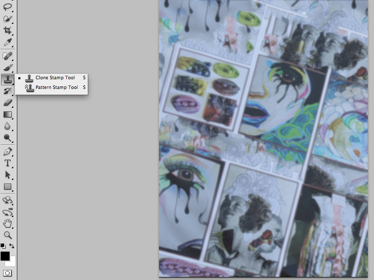
contents page blur with cloning material
This is the new contents page, I used the blur tool to blur the image and then used the clone stamp to fill in the gaps of the wall behind the picture and i believe that this is brilliant as it still shows the amazing artistic talents of the school and is also has a slight blur to be able to hold text.

Friday, 16 October 2015
front cover Text and house style
The text I have added is short and eye catching and coloured using the house colours of red and black, and are clear and easy to read. I used the text tool again and the Tarjar Pro font again, this shows I am keeping to the house style that I have chosen.

Thursday, 15 October 2015
Adding an eye catching title

For this, I used the text tool with a size of 36 pt and the font Trajan Pro as it was perfect for this cover as it was large, bold, easy to read and showed structure. This is what I want for my magazine, structure, so teachers will approve. Also I wanted it to be fun and exciting, so I decided to make the title with a crack patten and dark shadows, this makes it cool and smart at the same time.
edited background and cropping
I have edited the picture I had chosen for the front cover and I think it still looks a little off the mark.
I think it looks good but it does look like it needs more editing:

I think it looks good but it does look like it needs more editing:


This is the new edited one, using the crop tool, I edited the size of the picture to make it a medium close up shot. also I used the rule of thirds, a skill we learnt in class to take a better photo, to make the cover the best as it can be in regard to the image.
Also I used the eraser tool with the paint bucket tool to edit the covers background out so there will be a larger amount of space for text which I will put in.
Thursday, 1 October 2015
cover and contents pictures and why I chose them
This picture would be good as a contents page as it shows the schools artistic talent whilst also giving a plain enough background to hold writing that can be seen easily by anyone and this is why I chose this picture as it is coloufull enough to be eye catching but not enough to be too overwhelming.


This picture would be good enough for a front page as, with a bit of cropping, for example cropping the picture to be a medium close up, taking out the background and adding writing, it shows that our school is smart and structured at the same time

Sunday, 27 September 2015
Pictures decided
I have decided on my shots for my media project, I am taking it in the music room in front of some drums and guitars, both bass and normal, and I am standing with our music teacher, this is to symbolise student and teacher unity, also student and teacher friendship.
Wednesday, 23 September 2015
mise en scene
So I have decided on the locations for my shots to be taken, I feel these place shows what my school is really about: learning, fun and exploiting your talents.
My location is the art corridor with a lot of the artwork on display, this shot shows that my school is showing off the talents of our younger students, in the shot I am sitting wearing smart business wear on a ledge in front of a wall of year 10 art, this shows that my school is full of talented artists. I have chosen to do an over the shoulder shot as I believe this adds a sense of connection, the reason being, it looks as if the actors, myself and my friend Jamie, are having a conversation whilst I am drawing him, as I am using eye contact with him, Jamie is also wearing smart business wear, this was chosen as this shows our school is smartly dressed and in turn are extremely professional in the way they act and work.
I decided I was going to be holding a drawing pad and pencil to show that I was drawing, it added to the theme of art as I was, as mentioned underneath the year 10 art billboard, it shows that I myself am a person who likes to draw and shows that Oldershaw is full of artists like myself.
The Story I am intending to tell that the Academy is full of bright people who have many wonderful talents, and how at Oldershaw they learn to use their talents for the delight of others in the community whether it be acting, singing, dancing, cooking or in this instance art.
My shot will be taken in the art block of the Oldershaw Academy and will show that our Academy prides itself on its students talents.
My location is the art corridor with a lot of the artwork on display, this shot shows that my school is showing off the talents of our younger students, in the shot I am sitting wearing smart business wear on a ledge in front of a wall of year 10 art, this shows that my school is full of talented artists. I have chosen to do an over the shoulder shot as I believe this adds a sense of connection, the reason being, it looks as if the actors, myself and my friend Jamie, are having a conversation whilst I am drawing him, as I am using eye contact with him, Jamie is also wearing smart business wear, this was chosen as this shows our school is smartly dressed and in turn are extremely professional in the way they act and work.
I decided I was going to be holding a drawing pad and pencil to show that I was drawing, it added to the theme of art as I was, as mentioned underneath the year 10 art billboard, it shows that I myself am a person who likes to draw and shows that Oldershaw is full of artists like myself.
The Story I am intending to tell that the Academy is full of bright people who have many wonderful talents, and how at Oldershaw they learn to use their talents for the delight of others in the community whether it be acting, singing, dancing, cooking or in this instance art.
My shot will be taken in the art block of the Oldershaw Academy and will show that our Academy prides itself on its students talents.


Subscribe to:
Posts (Atom)