Thursday, 22 October 2015
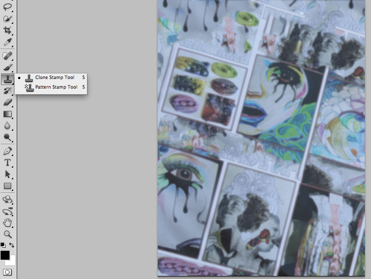
contents page blur with cloning material
This is the new contents page, I used the blur tool to blur the image and then used the clone stamp to fill in the gaps of the wall behind the picture and i believe that this is brilliant as it still shows the amazing artistic talents of the school and is also has a slight blur to be able to hold text.


Monday, 19 October 2015
Trainspotting
Trainspotting analysis.
The scene starts with a slight quiet soundbridge from the family sitting round the table and Renton lying on the floor, at the moment of the scene transition there is also a voice over of Renton, this continues till Renton begins to sit up, and the soundbridge continues till he begins to speak digetically, then slowly fades out, these two nondigetic sounds add nothing to the scene, but adds to a better transition from scene to scene. Through out the conversation with "Mother Superiour" there is no digetic or nondigetic sound, up till the line, "theres a long night that lies ahead" straight after the line had been said we hear a baby using typical baby noises for trying to speak, again I don't believe that this specifically adds to the scene, but it dose make the scene more of a stereotypical drug addicts den, as in every other film, nine times out of ten when the characters go into an addicts den, there is a baby crying or speaking. Back to the scene, after around three seconds of baby noises, a voice over comes on of Renton speaking his mind, in which he explains that they call a man there Mother Superiour on account of his lengthy habit, and admits he will have another shot of the drugs he is on. This add to the comedic of the scene as it contrasts two things, one that they call a man, Mother Superiour. And two, Renton tells Mother Superiour that he won't have another shot or hit, but he admits in the voice over that he will. This shows a comedic effect via contrediction.
There is no soundbridge into the next section. The opening titles. This only had one piece of main sound and that is a speeding train, this ties in with the title of the film which is trainspotting, and really that is the only thing the sound ties in with. Moving into the last few seconds of the title part we hear classical music, and this begins yet another soundbridge into the next scene, the best part about the classical music is that it is nondigetic contrapuntal sound, this means that the sound does not match the scene, his music continues through out the next scene and goes till the end of the scene with a voice over of Renton that sounds like a shopping list, this add to the comedic effect ofbthe scene.
Also some diegetic sounds are in the scene, such as hammering, putting things down and doors slamming.
The scene starts with a slight quiet soundbridge from the family sitting round the table and Renton lying on the floor, at the moment of the scene transition there is also a voice over of Renton, this continues till Renton begins to sit up, and the soundbridge continues till he begins to speak digetically, then slowly fades out, these two nondigetic sounds add nothing to the scene, but adds to a better transition from scene to scene. Through out the conversation with "Mother Superiour" there is no digetic or nondigetic sound, up till the line, "theres a long night that lies ahead" straight after the line had been said we hear a baby using typical baby noises for trying to speak, again I don't believe that this specifically adds to the scene, but it dose make the scene more of a stereotypical drug addicts den, as in every other film, nine times out of ten when the characters go into an addicts den, there is a baby crying or speaking. Back to the scene, after around three seconds of baby noises, a voice over comes on of Renton speaking his mind, in which he explains that they call a man there Mother Superiour on account of his lengthy habit, and admits he will have another shot of the drugs he is on. This add to the comedic of the scene as it contrasts two things, one that they call a man, Mother Superiour. And two, Renton tells Mother Superiour that he won't have another shot or hit, but he admits in the voice over that he will. This shows a comedic effect via contrediction.
There is no soundbridge into the next section. The opening titles. This only had one piece of main sound and that is a speeding train, this ties in with the title of the film which is trainspotting, and really that is the only thing the sound ties in with. Moving into the last few seconds of the title part we hear classical music, and this begins yet another soundbridge into the next scene, the best part about the classical music is that it is nondigetic contrapuntal sound, this means that the sound does not match the scene, his music continues through out the next scene and goes till the end of the scene with a voice over of Renton that sounds like a shopping list, this add to the comedic effect ofbthe scene.
Also some diegetic sounds are in the scene, such as hammering, putting things down and doors slamming.
Friday, 16 October 2015
front cover Text and house style
The text I have added is short and eye catching and coloured using the house colours of red and black, and are clear and easy to read. I used the text tool again and the Tarjar Pro font again, this shows I am keeping to the house style that I have chosen.

Thursday, 15 October 2015
Adding an eye catching title

For this, I used the text tool with a size of 36 pt and the font Trajan Pro as it was perfect for this cover as it was large, bold, easy to read and showed structure. This is what I want for my magazine, structure, so teachers will approve. Also I wanted it to be fun and exciting, so I decided to make the title with a crack patten and dark shadows, this makes it cool and smart at the same time.
edited background and cropping
I have edited the picture I had chosen for the front cover and I think it still looks a little off the mark.
I think it looks good but it does look like it needs more editing:

I think it looks good but it does look like it needs more editing:


This is the new edited one, using the crop tool, I edited the size of the picture to make it a medium close up shot. also I used the rule of thirds, a skill we learnt in class to take a better photo, to make the cover the best as it can be in regard to the image.
Also I used the eraser tool with the paint bucket tool to edit the covers background out so there will be a larger amount of space for text which I will put in.
Sunday, 11 October 2015
Mr Natton hmwk 1
1.
Two shot
Natural lighting
Steady cam
2.
Close up
Low key from left
Eye level shot
3.
Low angle shot
Close up
Natural light
4.
High angle shot
Two shot
Low key natural lighting
5.
Medium wide shot
Two shot
Low key
6.
Back light high angle
Wide shot
Adds tension to the scene
7.
Close up
Low key
Adds a lot of tension as it shows from the picture he probably does not want to be seen
8.
Selective focus
The director wants your attention on that specific thing
9.
Selective focus
The director wants your attention on that specific thing
Two shot
Natural lighting
Steady cam
2.
Close up
Low key from left
Eye level shot
3.
Low angle shot
Close up
Natural light
4.
High angle shot
Two shot
Low key natural lighting
5.
Medium wide shot
Two shot
Low key
6.
Back light high angle
Wide shot
Adds tension to the scene
7.
Close up
Low key
Adds a lot of tension as it shows from the picture he probably does not want to be seen
8.
Selective focus
The director wants your attention on that specific thing
9.
Selective focus
The director wants your attention on that specific thing
Thursday, 1 October 2015
cover and contents pictures and why I chose them
This picture would be good as a contents page as it shows the schools artistic talent whilst also giving a plain enough background to hold writing that can be seen easily by anyone and this is why I chose this picture as it is coloufull enough to be eye catching but not enough to be too overwhelming.


This picture would be good enough for a front page as, with a bit of cropping, for example cropping the picture to be a medium close up, taking out the background and adding writing, it shows that our school is smart and structured at the same time

Subscribe to:
Posts (Atom)