Tuesday, 3 November 2015

research genres

This is mainly R&B music and hip-hop music related and was first published in 1993

 It's mainly associated with rock, alternative and indie music genres and was founded in 1952
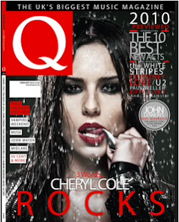
 Founded in october of 1986 and originally named Cue but changed its spelling to the single letter as it was sometimes mistaken as a snooker magazine, Q music magazine is mainly focused on rock and pop music  
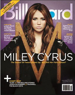
 Billboard is a multi genre magazine, which means it can use all types of genres, and was first published 121 years ago in 1894, november 1st, and has served for over 16,327 issues via circulation

 This mixed genre magazine was founded in 1977 and has circulated 75,000 issues
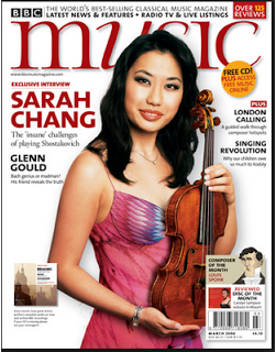
BBC music is primarily known for classical music but it also has a section for jazz and world music, usually tracks are played on BBC Radio 3 and has published CD's that include full length BBC recordings
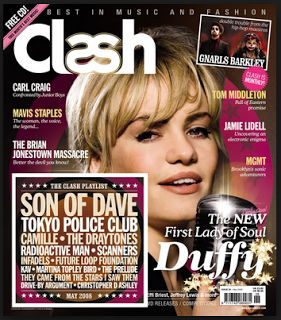
Clash Magazine is a popular music and fashion magazine that brings out ten magazine per year and was founded in 2004 and brought out by music republic ltd
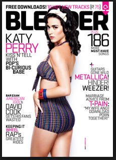
"the ultimate guide to music and more" blender is an american mixed genre magazine that ran from 1994 to april 2009. It also has an indian edition that was first published in the may of 2008

Classical musi is a classical music magazine that was first published on the 25 of september 1976

the source is a magazine that is printed ten times per year like clash but is orbited around hip-hop music and also politics and cutiure. the magazine was first published in 1988

Research into music magazines

I have researched into music magazines and these are the magazines that initially caught my eye


 This shows that there are a lot of music magazines out there and I have selected the ten that caught my eye.

Friday, 23 October 2015

final contents page

This is my final contents page. I believe the background is a bit busy, I believe there is too much going on and it can distract the reader from the page, so I believe in my next design I will use a solid colour  colours for this page and this will make the page easier to read and much more structured. I believe I need more pictures on the contents page and I have too much wasted space. In my next task I will add more pictures and this will make the contents page more eye catching. I believe that this page is an okay attempt as it is my first time using adobe photoshop.

Final front cover

This is my final cover design, I have decided to add a bar code and issue information in the footer and this is to use more of the wasted space, sticking to the rule of thirds technique we learnt in class.
I believe my editing skills need to improve a bit as i have not edited the picture of jack very well, around the edges you can see clearly where i have cropped the photo and erased parts, this will improve via me editing other pictures in my own time and this will help me improve my editing skills. also I believe i need to add more pictures into the next design as int his one it looks a little bit bland, plain and basic. I can do this by experimenting with different colours and styles of picture shots such as low angle, wide shots, extreme closeups, etc, in different lighting, to see what colours compliment certain types of shots. All in all though in believe it is a good first attempt of using photoshop.

adding the page number

I have added a page number  the and also changed to the page numbers so I could use more wasted space and thus have used more of the rule of thirds in my work, I used the Tarjar Pro font for the page number and put it in red and thus kept with house style I have used.

Thursday, 22 October 2015

Contents new header and text designs using the effects available

I have added the effects that are on the cover sticking to the house style I chose, I added effects to the layer that the text for the writing was on and I created the effects seen on the title header and thus made it easy to read.
 Also I have added text using the text tool and have added an effect to it called a shadow effect to help it stand out and also make it easier to read and understand 

Contents page hedder

I have added a title that is in the same font and style as the front cover, this is sticking to the house style of the text being in black and red, also i will be i will be editing it to be in exactly the same style as the front cover, this will add to the house style feeling. I used the text tool to produce the text and it was also in Tarjar Pro.