Friday, 12 February 2016
headline
The headline for my magazine is "HE'S BACK!" with a sub heading of "And this time its Personal-ity" this will hopefully capture the attention on the readers as they will want to know who is back. The reason this headline is because I am playing up the story that Rhino was a big name in the music industry and he just suddenly stopped making music and now he is back and is going to tell his story of why he stopper playing ad making music. This would draw the readers in.

D.N.A Magazine Masthead
My masthead is the most important part of my magazine and will have to be the part that stands out most on my front cover. I have decided on the title of my magazine and created a logo for my first draft design I have decided on doing.
 The reason i have chosen D.N.A is that, people say music is a part of them and that they connect with it on an intense level, it also links to the fact that the music is in our blood. D.N.A stands for Decibels Noise Amplitude as that is to do with sound and music s that captures the link between D.N.A and music.

Friday, 29 January 2016
top three pics for the double page spread
 These are the top three pictures that i have chosen for my double page spread.
 This I like as it shows attitude as you can see all of his face, this is nice as you are really drawn to the picture and are able to focus in the picture.
 This picture I like for the same reasons as the last.
final pictures
 These are the final pictures that I have chosen for my magazine, this is the a front cover as it shows a certain edge of attitude in the facial expression as it is a stern facial expression and will capture the attention on the target audience.
 This is easy to edit and has the ability to keep the audience focused on the page and look at what comes into the article.
 I can use the face that he is looking over the page as a way of linking the pages.
top three pictures for my contence page
i have chosen these pictures for my contense page I believe that they will be easy to put text on and still captures the eye of the reader.
 The way he looks into the distance with the Sun shining in his face and the shadow on him adds a bad ass look to him.
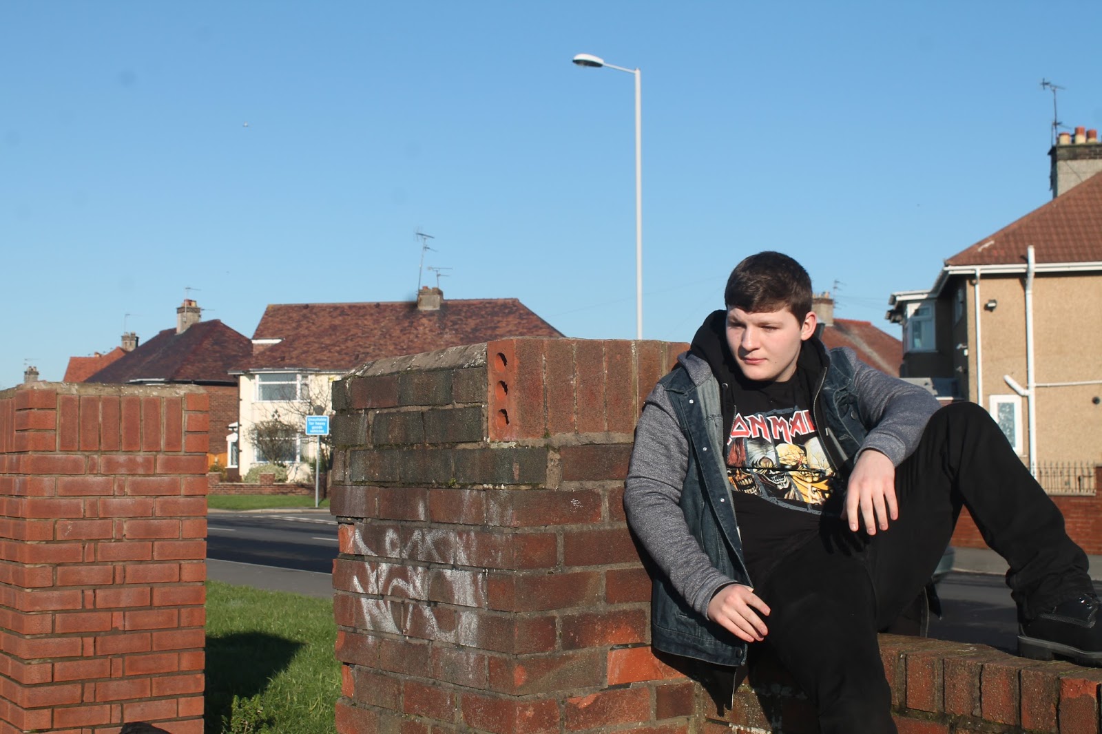 This looks nice as it shows a slight air of "all about the music" to it, it also shows the street music vibe from the street setting via the wall and the houses and that's why I like it.
best selection for my front cover
These are my final pictures for the front cover of my magazine, this blog consists on my top three pictures for my magazine.
 I like them as it shows a certain edge of attitude that I want for my magazine.

final photo shoot
 These are the final pictures I took on the Wednesdays of the photo shoot, Theses pictures do not use props but in my eyes you can tell that it is a music magazine form his costume and his posture and body language also his facial expression.


Subscribe to:
Posts (Atom)