as media
Tuesday, 24 May 2016
Friday, 13 May 2016
3. What kind of media institution might distribute your media product and why?
I would most likely be going down the path of worldwide magazine distributors, the reason is because of this (a quote form their website) "WWMD handles over 3000 magazine titles in every market sector with an emphasis on specialist and niche titles and our clients usually stock anywhere between one and 300 titles. If you are a specialist retailer we will build a magazine sales programme targeted to your customers and designed to support your core products." In essence, it would work better for my magazine as there is a pre determined audience for my magazine, and with the amount of magazines they distribute i could have some advertisement in other sector of magazines such as gardening and food to get more awareness of my magazine. Also they specialise in all types of magazines especially niche titles like mine.
1. In what ways does your media product use, develop or challenge forms and conventions of real media products?
I think, in my opinion that i have been able to design a magazine that could be issued to the public and bought. I have stayed on the basic level in terms of design but have tried to expresses and push the boundaries of my creativity in this project. starting out i did not stick t the style models and produced some out there creations but after reigning in the ideas and sticking to basic methods of magazine design i managed to crete a piece that i am quite proud of.


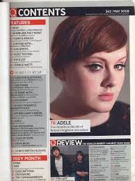
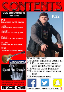
My contents page i based of the q magazine contents page. You can see that the basic set up is copied as is with the front cover, I've added a twist. My red boarder has come back to add a house style along with the white on red writing technique.
This is a flip effect of the colour scheme used by Q here where they have a red title with white background and black writing, I have used a black heading with red background and white writing, This was to add my own features and not just copying. I ahve added more pictures to make the page itself more interw=esting and not bland like a lot of contence pages are. But i have added the social media nd website information on the contence page to add my own twist on the more commonly used front cover information
2. How does your media product represent particular social groups?
my magazine portrays the rock and metal culture of the music world. It is a very small and rapidly reducing social group of mainly older people and socially outcast teenagers. The big names on the cover like the combination megadeth and metallica to make metadeth, Ozzy ozborne, Queen, the Beatles, slayer, anthrax, slipknot, motorhead, Lemmy and Corey Taylor. The colour scheme is white red and black, colours which are mainly associated with Rock and Roll. The4 word hell is used which is also associated with Rock and roll and metal. The Iron Maiden T-shirt that rhino has on suggests that there is a rock or metal theme, to the magazine, simply because Iron Maiden is a large band in the metal world and are a house hold name for anyone as all people have had to have heard of iron maiden.
7. Looking back at your preliminary task, what do you feel you have learnt in the progression from it to the full product?
Looking back at my preliminary tack I have noticed that so many things have gotten better, by a large standard.
We can see that the editing around the head has significantly increased in standards, my creation skills have definitely improved also, for example:
 This is my prelim task, it is obvious from the pictur epresented here on the cover that my editing skills were not very good, infact I was a beginner, we can see the editing round the head if awefol the sholder cropping is also quite bad, it is far from te wrost ive ever seen but it does come close.
We can see that the editing around the head has significantly increased in standards, my creation skills have definitely improved also, for example:
 This is my prelim task, it is obvious from the pictur epresented here on the cover that my editing skills were not very good, infact I was a beginner, we can see the editing round the head if awefol the sholder cropping is also quite bad, it is far from te wrost ive ever seen but it does come close.
Where as the cropped image from the final product is much more crisp and clean around the head, the edges are much more defined and stand out eyecatching.
4. Who would be the audience for your media product?
I would mainly aim my magazine at at teenagers from 13 to 19 years in specifics, this is because a younger audience may not understand my magazine double page story enough to fully appreciate the deepness of the story. Also I wouldn't aim it at older than 19 as they wouldn't care enough about the story. Not to say that people out of the age range cant read it ti is just i want to mainly aim the product at 13 to 19, mainly as i can get away with a more diverse story line and fir people to fully appreciate the bands in my magazine.
Subscribe to:
Comments (Atom)


