I think, in my opinion that i have been able to design a magazine that could be issued to the public and bought. I have stayed on the basic level in terms of design but have tried to expresses and push the boundaries of my creativity in this project. starting out i did not stick t the style models and produced some out there creations but after reigning in the ideas and sticking to basic methods of magazine design i managed to crete a piece that i am quite proud of.
My cover is mainly based on a mixture of Q magazine and NME, two large magazines in the music world, the layout design is based of on NME's basic layout design and i believe this works with my own design and picture, the blank background adds a stand out effect ti my picture, and the white writhing on the red boarders adds a eye-catching stand out effect my opinion and works well in a colour scheme. this colour scheme was borrowed from the Q logo as it really stands out and catches the eye of anyone looking at it. I tried to keep in the same writing layout as the NME style model I picked out but add some of my own twists to it at the same time, for example the 'RHINO' heading is across the picture but on an angle to add some diversity to ht design as the other style models didn't have that slanted design and it worked well with my ideas. it is also a technique that is more affiliated with the younger generation with young children's and teenagers magazines using slanted writing t make it eye-catching. for example
this was done as to attract my target audience which is 13-19 year olds. I added popular names on the cover to try and attract more readers, for example, adding Ozzy Oboune and motorhead and lemmy will appeal to the metal heads, Beatles for Rock and roll fans, also Guns and roses for the hard rock fan army, this would be the basis of getting a wider audience for my magazine and is what all major magazines do to attract a lager audience and i have adapted this technique as it is majorly successful in the magazine world.


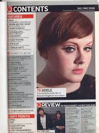
My contents page i based of the q magazine contents page. You can see that the basic set up is copied as is with the front cover, I've added a twist. My red boarder has come back to add a house style along with the white on red writing technique.
This is a flip effect of the colour scheme used by Q here where they have a red title with white background and black writing, I have used a black heading with red background and white writing, This was to add my own features and not just copying. I ahve added more pictures to make the page itself more interw=esting and not bland like a lot of contence pages are. But i have added the social media nd website information on the contence page to add my own twist on the more commonly used front cover information


No comments:
Post a Comment