Tuesday, 15 December 2015

Costume

The costumes I have have chosen are these.
Rhino is wearing a band t shirt of slipknot, dark blue jeans and  with this logo on:


Also he has a slipknot jacket he is wearing, as it plays on the fact that my magazine uses all genres and slipknot is a metal band. Also he has a Gibson les Paul faded cherry usa studio pro that he is using

Jamie will be wearing exactly this:


As this is a pretty basic set of clothing and can be interoperated into any genre, it is all black, so it is practically multi genre set of clothing and it relates to the fact that my magazine is a multi genre magazine.


Kyle will be wearing this:
It is a plain white shirt and a pair of blue jeans, a pretty basic set of clothing this also playing with my magazines multi genre style.  


Finally Zhong will be wearing this:

Monday, 14 December 2015

Props (Relevant to a Music Magazine)

I will be using a Jonny Brooks guitar for the shoot, it is red based but all metallic parts are gold, a white tipped whammy bar is also present. I an using this for the simple reason that I have it and it is easy to play, also counting the fact that it looks brilliant and is very much eye catching.
Image result for johnny brook guitar

Jamie will be playing a basic green bass guitar to go with his all black outfit, it is a basic green colour with a black headstock, it is accompanied be a black strap with orange tie around it, I used this as it is plain, it shows that it can still be linked to any musical genre.


Also there will be a black flying V being used, I am using it as it is a well known guitar style and is used in multi genre music.
Image result for black flying v
A basic red drum kit will be used also as it will be fitting with the theme of multi genre.

finally I am also using a Gibson les Paul faded cherry usa studio pro which belongs to rhino as it adds a certain sense of individuality to my magazine as it is not a common guitar. I t will help my magazine stand out.

A record of your Time Management i.e dates when you plan to complete each task

I plan on taking the photos during the Christmas holidays this is because I have an unlimited amount of time to set up the set and work on the fine details, so the magazine should be finished by the end of January.

Camera Angles influenced by Stle Models & real media products

I am going to have, for the front cover, a medium wide shot with my actors in a boxed arrow position,

My Actors

My Actors are "Rhino" Jake Navarro, Kyle Dos Santos, Zhongwei Zhao and Jamie Pears.

Kyle


Jamie with the ginger hair, Rhino in the middle

Zhong in the black blazer

Tuesday, 8 December 2015

Location

The location for my photo shoot will be the in my front room in front of a white sheet, as it was one of the first places I ever played music and is where I wrote my first song.
I chose the set as with its white sheet it is a plain and basic set up. This is brilliant for me as it not only is easy to edit, but is relates to the fact that it's all about the music and there is no need for fancy equipment or lights, it's all about the music.

Thursday, 26 November 2015

findings of research

Using rhe research i have collected in me y pasyt posts, i have decided on the type of magazine i am going to make.

I have decided on a mixed genre magazine as it will draw in more people to my magazine, it shows via the amount of people who read Q magazine, a magazine that i chose in my previous blogs. Q magazine has generated  52,781 readers and it is a


Friday, 20 November 2015

The companies

Q magazine is published Bauer Media Group, this is a world famous company that has over 400 digital productions and 50 radio and TV stations around the world. It had made approximately 2.4 billion euros by 2013. They have circulated 52,781 readers of Q magazine from January to December in 2013.

Clash magazine is published by John O'Rourke, based in Dundee, he has managed to get the magazine published in 30 different countries around the world, 99 issues of clash magazine have been published.

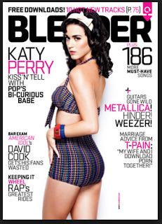
Blender was published by Dennis Publishing form 1994-2009. Dennis publishing was an independent company founded by Felix Dennis in1974. butthe company that ran blender was the Alpha Media Group, it is a growing radio broadcast media company that has a passion for outstanding radio and digital content for their listener community.With this philosophy, it meant that blender magazine achieved a grand total of 800,000 readers in their January and February issues in 2007. 

Thursday, 19 November 2015

cover artists

The cover artists on each of my magazines have been global mega stars, this is a basic name dropping technique, this allows you to gain more readers by showing a popular celebrity or celebrities on the cover to attract followers and get them interested in your product, in this case a magazine. (another use of this tactic is that you will often fine that the article you are looking for is in the end quarter of the first half of the magazine, this is so people will read the articles before hand and possibly want to read on afterwards to see if there is and more good content if they find the contents satisfactory and in their taste)
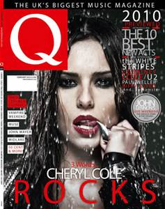
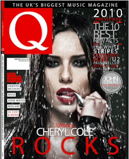
An example of this technique is used on Q magazine with Cheryl Cole.

Market

The audience for my magazine is going to be teenagers, this is because teenagers are more likely to buy a music magazine than older people are. A higher percentage of teenagers buy a music magazine of popular music as it is more popular to do so in our generation as the music the current generation listens to is un appealing to the older generation and this is why my audience in teenagers.
I am planning on making it a magazine for all genders as it will increase sales and therefore maximise profits, also I will be able to expand my market perimeters, for example, the magazine will be appealing to both sexes so it demolishes any worries that readers may have of only gender specific content .
My magazine will also be for everyone, no specific class systems, it will be available for everyone to buy and for whoever wants it.

Tuesday, 17 November 2015

style models

I personally love the way this is set out, it's got that ultimate professional feel to it and has clear easy to read writing, the colour scheme matches the picture, the rain effect really adds a drawing in effect to the cover as it works well with the title, "3 Words... CHERYL COLE ROCKS".

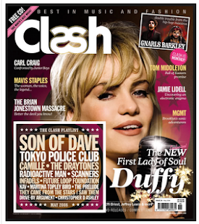
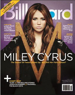
I like this cover for the same reasons as the previous one, for example, the colour scheme really complements the model/artist/singer and it helps the cover be more eye catching, also the layout is clear and the fonts are easy to read.

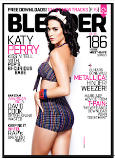
This is a more simple magazine cover made by blender but it is not as cluttered and coloured, but i believe it doesn't need it, the image is emphasised by the white background and the pink and black font colours in the colour scheme.

genres that interest me


I myself like all types of music genres, ranging from classical to death metal, dub-step to jazz and pop-punk to mariachi, so I believe mixed genre magazine music will suit best.  


Tuesday, 3 November 2015

research genres

This is mainly R&B music and hip-hop music related and was first published in 1993

 It's mainly associated with rock, alternative and indie music genres and was founded in 1952

 Founded in october of 1986 and originally named Cue but changed its spelling to the single letter as it was sometimes mistaken as a snooker magazine, Q music magazine is mainly focused on rock and pop music  

 Billboard is a multi genre magazine, which means it can use all types of genres, and was first published 121 years ago in 1894, november 1st, and has served for over 16,327 issues via circulation

 This mixed genre magazine was founded in 1977 and has circulated 75,000 issues

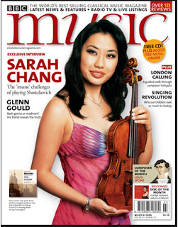
BBC music is primarily known for classical music but it also has a section for jazz and world music, usually tracks are played on BBC Radio 3 and has published CD's that include full length BBC recordings

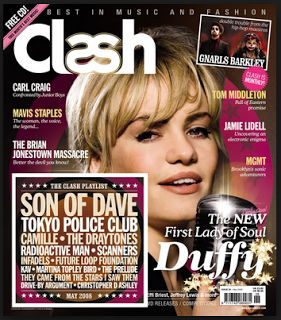
Clash Magazine is a popular music and fashion magazine that brings out ten magazine per year and was founded in 2004 and brought out by music republic ltd

"the ultimate guide to music and more" blender is an american mixed genre magazine that ran from 1994 to april 2009. It also has an indian edition that was first published in the may of 2008

Classical musi is a classical music magazine that was first published on the 25 of september 1976

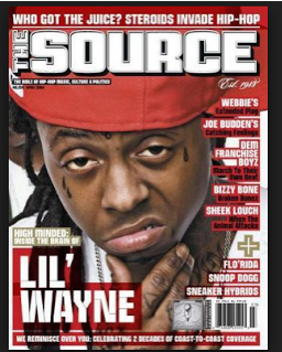
the source is a magazine that is printed ten times per year like clash but is orbited around hip-hop music and also politics and cutiure. the magazine was first published in 1988

Research into music magazines

I have researched into music magazines and these are the magazines that initially caught my eye


 This shows that there are a lot of music magazines out there and I have selected the ten that caught my eye.

Friday, 23 October 2015

final contents page

This is my final contents page. I believe the background is a bit busy, I believe there is too much going on and it can distract the reader from the page, so I believe in my next design I will use a solid colour  colours for this page and this will make the page easier to read and much more structured. I believe I need more pictures on the contents page and I have too much wasted space. In my next task I will add more pictures and this will make the contents page more eye catching. I believe that this page is an okay attempt as it is my first time using adobe photoshop.

Final front cover

This is my final cover design, I have decided to add a bar code and issue information in the footer and this is to use more of the wasted space, sticking to the rule of thirds technique we learnt in class.
I believe my editing skills need to improve a bit as i have not edited the picture of jack very well, around the edges you can see clearly where i have cropped the photo and erased parts, this will improve via me editing other pictures in my own time and this will help me improve my editing skills. also I believe i need to add more pictures into the next design as int his one it looks a little bit bland, plain and basic. I can do this by experimenting with different colours and styles of picture shots such as low angle, wide shots, extreme closeups, etc, in different lighting, to see what colours compliment certain types of shots. All in all though in believe it is a good first attempt of using photoshop.

adding the page number

I have added a page number  the and also changed to the page numbers so I could use more wasted space and thus have used more of the rule of thirds in my work, I used the Tarjar Pro font for the page number and put it in red and thus kept with house style I have used.

Thursday, 22 October 2015

Contents new header and text designs using the effects available

I have added the effects that are on the cover sticking to the house style I chose, I added effects to the layer that the text for the writing was on and I created the effects seen on the title header and thus made it easy to read.
 Also I have added text using the text tool and have added an effect to it called a shadow effect to help it stand out and also make it easier to read and understand 

Contents page hedder

I have added a title that is in the same font and style as the front cover, this is sticking to the house style of the text being in black and red, also i will be i will be editing it to be in exactly the same style as the front cover, this will add to the house style feeling. I used the text tool to produce the text and it was also in Tarjar Pro.

contents page blur with cloning material

This is the new contents page, I used the blur tool to blur the image and then used the clone stamp to fill in the gaps of the wall behind the picture and i believe that this is brilliant as it still shows the amazing artistic talents of the school and is also has a slight blur to be able to hold text.
 

Monday, 19 October 2015

Trainspotting

Trainspotting analysis.
The scene starts with a slight quiet soundbridge from the family sitting round the table and Renton lying on the floor, at the moment of the scene transition there is also a voice over of Renton, this continues till Renton begins to sit up, and the soundbridge continues till he begins to speak digetically, then slowly fades out, these two nondigetic sounds add nothing to the scene, but adds to a better transition from scene to scene. Through out the conversation with "Mother Superiour" there is no digetic or nondigetic sound, up till the line, "theres a long night that lies ahead" straight after the line had been said we hear a baby using typical baby noises for trying to speak, again I don't believe that this specifically adds to the scene, but it dose make the scene more of a stereotypical drug addicts den, as in every other film, nine times out of ten when the characters go into an addicts den, there is a baby crying or speaking. Back to the scene, after around three seconds of baby noises, a voice over comes on of Renton speaking his mind, in which he explains that they call a man there Mother Superiour on account of his lengthy habit, and admits he will have another shot of the drugs he is on. This add to the comedic of the scene as it contrasts two things, one that they call a man, Mother Superiour. And two, Renton tells Mother Superiour that he won't have another shot or hit, but he admits in the voice over that he will. This shows a comedic effect via contrediction.

There is no soundbridge into the next section. The opening titles. This only had one piece of main sound and that is a speeding train, this ties in with the title of the film which is trainspotting, and really that is the only thing the sound ties in with. Moving into the last few seconds of the title part we hear classical music, and this begins yet another soundbridge into the next scene, the best part about the classical music is that it is nondigetic contrapuntal sound, this means that the sound does not match the scene, his music continues through out the next scene and goes till the end of the scene with a voice over of Renton that sounds like a shopping list, this add to the comedic effect ofbthe scene.
Also some diegetic sounds are in the scene, such as hammering, putting things down and doors slamming. 

Friday, 16 October 2015

front cover Text and house style

The text I have added is short and eye catching and coloured using the house colours of red and black, and are clear and easy to read. I used the text tool again and the Tarjar Pro font again, this shows I am keeping to the house style that I have chosen.

Thursday, 15 October 2015

Adding an eye catching title


I have decided to make the title eye catching.
For this, I used the text tool with a size of 36 pt and the font Trajan Pro as it was perfect for this cover as it was large, bold, easy to read and showed structure. This is what I want for my magazine, structure, so teachers will approve. Also I wanted it to be fun and exciting, so I decided to make the title with a crack patten and dark shadows, this makes it cool and smart at the same time. 

edited background and cropping

I have edited the picture I had chosen for the front cover and I think it still looks a little off the mark.
I think it looks good but it does look like it needs more editing:


This is the original 


This is the new edited one, using the crop tool, I edited the size of the picture to make it a medium close up shot. also I used the rule of thirds, a skill we learnt in class to take a better photo, to make the cover the best as it can be in regard to the image.

Also I used the eraser tool with the paint bucket tool to edit the covers background out so there will be a larger amount of space for text which I will put in.

Sunday, 11 October 2015

Mr Natton hmwk 1

1.
Two shot
Natural lighting
Steady cam

2.
Close up
Low key from left
Eye level shot

3.
Low angle shot
Close up
Natural light

4.
High angle shot
Two shot
Low key natural lighting

5.
Medium wide shot
Two shot
Low key

6.
Back light high angle
Wide shot
Adds tension to the scene

7.
Close up
Low key
Adds a lot of tension as it shows from the picture he probably does not want to be seen

8.
Selective focus
The director wants your attention on that specific thing

9.
Selective focus 
The director wants your attention on that specific thing 


Thursday, 1 October 2015

cover and contents pictures and why I chose them

This picture would be good as a contents page as it shows the schools artistic talent whilst also giving a plain enough background to hold writing that can be seen easily by anyone and this is why I chose this picture as it is coloufull enough to be eye catching but not enough to be too overwhelming.


This picture would be good enough for a front page as, with a bit of cropping, for example cropping the picture to be a medium close up, taking out the background and adding writing, it shows that our school is smart and structured at the same time


Sunday, 27 September 2015

Pictures decided

I have decided on my shots for my media project, I am taking it in the music room in front of some drums and guitars, both bass and normal, and I am standing with our music teacher, this is to symbolise student and teacher unity, also student and teacher friendship.

Wednesday, 23 September 2015

Blogs

OCR
http://ocrmediastudies.weebly.com/

Mike Liddell
http://oamedia.blogspot.com/

mise en scene

So I have decided on the locations for my shots to be taken, I feel these place shows what my school is really about: learning, fun and exploiting your talents.
My location is the art corridor with a lot of the artwork on display, this shot shows that my school is showing off the talents of our younger students, in the shot I am sitting wearing smart business wear on a ledge in front of a wall of year 10 art, this shows that my school is full of talented artists. I have chosen to do an over the shoulder shot as I believe this adds a sense of connection, the reason being, it looks as if the actors, myself and my friend Jamie, are having a conversation whilst I am drawing him, as I am using eye contact with him, Jamie is also wearing smart business wear, this was chosen as this shows our school is smartly dressed and in turn are extremely professional in the way they act and work.
I decided I was going to be holding a drawing pad and pencil to show that I was drawing, it added to the theme of art as I was, as mentioned underneath the year 10 art billboard, it shows that I myself am a person who likes to draw and shows that Oldershaw is full of artists like myself.

The Story I am intending to tell that the Academy is full of bright people who have many wonderful talents, and how at Oldershaw they learn to use their talents for the delight of others in the community whether it be acting, singing, dancing, cooking or in this instance art.
My shot will be taken in the art block of the Oldershaw Academy and will show that our Academy prides itself on its students talents.

Examples of school magazines


Examples of school magazines.