 I personally love the way this is set out, it's got that ultimate professional feel to it and has clear easy to read writing, the colour scheme matches the picture, the rain effect really adds a drawing in effect to the cover as it works well with the title, "3 Words... CHERYL COLE ROCKS".
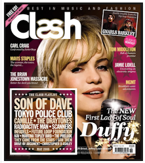
 I like this cover for the same reasons as the previous one, for example, the colour scheme really complements the model/artist/singer and it helps the cover be more eye catching, also the layout is clear and the fonts are easy to read.
 This is a more simple magazine cover made by blender but it is not as cluttered and coloured, but i believe it doesn't need it, the image is emphasised by the white background and the pink and black font colours in the colour scheme.
No comments:
Post a Comment