Tuesday, 24 May 2016
Friday, 13 May 2016
3. What kind of media institution might distribute your media product and why?
I would most likely be going down the path of worldwide magazine distributors, the reason is because of this (a quote form their website) "WWMD handles over 3000 magazine titles in every market sector with an emphasis on specialist and niche titles and our clients usually stock anywhere between one and 300 titles. If you are a specialist retailer we will build a magazine sales programme targeted to your customers and designed to support your core products." In essence, it would work better for my magazine as there is a pre determined audience for my magazine, and with the amount of magazines they distribute i could have some advertisement in other sector of magazines such as gardening and food to get more awareness of my magazine. Also they specialise in all types of magazines especially niche titles like mine.
1. In what ways does your media product use, develop or challenge forms and conventions of real media products?
I think, in my opinion that i have been able to design a magazine that could be issued to the public and bought. I have stayed on the basic level in terms of design but have tried to expresses and push the boundaries of my creativity in this project. starting out i did not stick t the style models and produced some out there creations but after reigning in the ideas and sticking to basic methods of magazine design i managed to crete a piece that i am quite proud of.

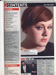
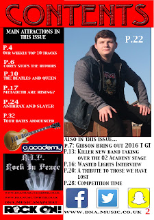
My contents page i based of the q magazine contents page. You can see that the basic set up is copied as is with the front cover, I've added a twist. My red boarder has come back to add a house style along with the white on red writing technique.
This is a flip effect of the colour scheme used by Q here where they have a red title with white background and black writing, I have used a black heading with red background and white writing, This was to add my own features and not just copying. I ahve added more pictures to make the page itself more interw=esting and not bland like a lot of contence pages are. But i have added the social media nd website information on the contence page to add my own twist on the more commonly used front cover information
2. How does your media product represent particular social groups?
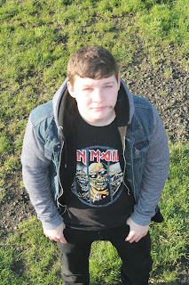
my magazine portrays the rock and metal culture of the music world. It is a very small and rapidly reducing social group of mainly older people and socially outcast teenagers. The big names on the cover like the combination megadeth and metallica to make metadeth, Ozzy ozborne, Queen, the Beatles, slayer, anthrax, slipknot, motorhead, Lemmy and Corey Taylor. The colour scheme is white red and black, colours which are mainly associated with Rock and Roll. The4 word hell is used which is also associated with Rock and roll and metal. The Iron Maiden T-shirt that rhino has on suggests that there is a rock or metal theme, to the magazine, simply because Iron Maiden is a large band in the metal world and are a house hold name for anyone as all people have had to have heard of iron maiden.
7. Looking back at your preliminary task, what do you feel you have learnt in the progression from it to the full product?
Looking back at my preliminary tack I have noticed that so many things have gotten better, by a large standard.
We can see that the editing around the head has significantly increased in standards, my creation skills have definitely improved also, for example:
 This is my prelim task, it is obvious from the pictur epresented here on the cover that my editing skills were not very good, infact I was a beginner, we can see the editing round the head if awefol the sholder cropping is also quite bad, it is far from te wrost ive ever seen but it does come close.
We can see that the editing around the head has significantly increased in standards, my creation skills have definitely improved also, for example:
 This is my prelim task, it is obvious from the pictur epresented here on the cover that my editing skills were not very good, infact I was a beginner, we can see the editing round the head if awefol the sholder cropping is also quite bad, it is far from te wrost ive ever seen but it does come close.
Where as the cropped image from the final product is much more crisp and clean around the head, the edges are much more defined and stand out eyecatching.
4. Who would be the audience for your media product?
I would mainly aim my magazine at at teenagers from 13 to 19 years in specifics, this is because a younger audience may not understand my magazine double page story enough to fully appreciate the deepness of the story. Also I wouldn't aim it at older than 19 as they wouldn't care enough about the story. Not to say that people out of the age range cant read it ti is just i want to mainly aim the product at 13 to 19, mainly as i can get away with a more diverse story line and fir people to fully appreciate the bands in my magazine.
Monday, 9 May 2016
cover design
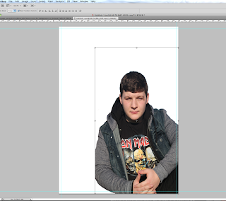 For my magazine i started off with a blank canvas of A4, i then proceeded to crop the background out of my picture I chose and paste onto the canvas and reduce the size to make room for text and headlines.
the colour scheme was adapted from Q magazine as it is a popular magazine and the colours fitted well with the concepts I had thought of.
 I then added a red border to allow for some background like in Q magazine only my own take on it. A mix of the Q and NME styles that is a theme through out my magazine.
Tuesday, 19 April 2016
warner bros
Time Warner Inc is an American Multinational media and entertainment conglomerate headquartered in the Time Warner Center in New York City. It is currently the world's third largest television networks and filmed TV & entertainment company in terms of revenue , and at one time was the world's largest media conglomerate.
Warner brothers is part of a conglomerate, this conglomerate is called Time Warner. Time Warner was formed in 1990 through the merger of Time Inc. and Warner Communications. The current company consists largely of the assets of the former Warner Communications, as well as HBO and the assets of Turner Broadcasting . Time Warner currently has major operations in film and television, with a limited amount of publishing operations. Among its assets are New Line Cinema, HBO, Turner Broadcasting System, The CW Television Network, Warner Bros., Cartoon Network, Boomerang, Adult Swim, CNN, DC Comics, Warner Bros. Animation, Cartoon Network Studios, Hanna-Barbera, Esporte Interativo, Castle Rock Entertainment and Warner Bros. Interactive Entertainment.
Warner Bros established a showcase cinema in Leicester Square as early as 1938. In August 1941 Warner Bros acquired a 25 per cent stake in Associated British Picture Corporation (ABPC). Three months later, J Arthur Rank's General Cinema Finance Corporation (GCFC)—which had bought into the Odeon cinema chain in 1938—took over Gaumont-British Picture Corporation. Included in the deal were Gaumont-British’s 251 cinemas and the Lime Grove studios at Shepherds Bush, west London, giving the Rank Organisation a chain of over 600 cinemas and boosting its production capacity. ABPC has 442 cinemas. These two chains, later known as the 'duopoly', then controlled 24 per cent of all UK screens and dominated exhibition for the next 50 years. Both were also involved in production.By 1945 Warner's attempt to gain control of ABPC led to a 10-year agreement with the Board of Trade that it could benefit from its increased shareholding but not with voting rights. In theory, Warner would distribute ABPC films in their 800-screen US cinema chain, while ABPC would show Warner films in its UK cinemas. However, few British productions resulted from the tie-up and in 1961 Warner agreed with the Board of Trade to sell its shares.In March 1943 UK's most successful producer, Sir Alexander Korda, agreed a merger of his London Film Productions with MGM, only to buy the business back in 1945. The company had no exhibition interests. However, the Rank Organisation, which did, sold its unused Amalgamated Studios at Elstree, acquired in 1938, to the Prudential Assurance Company in 1947, which promptly sold the facility on to MGM, whose involvement in UK production was to prove far more prolific than Warner's.EMI bought a stake in ABPC in 1968 by acquiring the remaining Warner Bros shares and launched a bid for full control. In 1970 MGM closed its studio at Elstree and in partnership with EMI formed EMI-MGM Elstree Studios at the former ABPC studios but MGM withdrew from the arrangement in 1973.
Warner bros has a lot to compete with in its area of expertise:
PARAMOUNT PICTURES CORPORATION
When entertainment is paramount, many people turn to Paramount Pictures Corporation. A subsidiary of media firm Viacom , the company produces and distributes films through Paramount Pictures, Paramount Animation, Paramount Classics, Insurge Pictures, MTV Films, Nickelodeon Movies, andParamount Vantage . It maintains the Paramount Pictures library of some 3,500 films, including classic hits from the Star Trek, Godfather, and Indiana Jones series, and releases about a dozen new titles annually. Paramount Pictures distributes movies on video and DVD through Paramount Home Entertainment . The studio ceased to own DreamWorks in 2008.
Fox Filmed Entertainment
Fox Filmed Entertainment (FFE) isn't choosy when it comes to an entertainment medium. The film and television production and home entertainment arm of the Twenty-First Century Fox (formerly News Corporation) media empire produces all genres of films through studios such as Twentieth Century Fox , Fox Searchlight , and Blue Sky Studios . It produces television shows through Twentieth Century Fox Television . Fox Home Entertainment releases more than 1,000 film and TV titles each year to the home video market; it also has distribution deals with MGM and Lions Gate . FFE accounts for more than 20% of its parent company's revenues.
The Walt Disney Studios
A certain famous mouse may live in the Magic Kingdom, but he works in Hollywood. The Walt Disney Studios, the motion picture arm of The Walt Disney Company , is one of the world's largest movie businesses. It produces and distributes live-action titles through the Walt Disney Pictures and Touchstone banners, including films from its hit Pirates of the Caribbean series (two of which are among the top ten money-makers of all time). Subsidiary Pixar is responsible for animated titles (Toy Story 3), while affiliate Marvel creates superhero flicks (Iron Man 2). The firm also runs Walt Disney Animation Studios and Walt Disney Studios Home Entertainment . Other divisions are devoted to music and live stage plays.
what is the target audience for warner bros?
According to the warner bros official website on the final paragraph of the about warner bros section it states the following "The final component of WBTVG is broadcasting: The CW Television Network—launched (in partnership with CBS) in September 2006 with quality, diverse programming—is targeted to the 18–34 audience on television and online through CWTV.com."
Globalisation has helped to exand this target audience as more perple are exposed to the company so more people around the world can waich the product produced by it.
Warner bros has been very sucscessful in their time getting a total revenue of 12.992 billion US dollas in 2015. An example of Warner bros using synergy was in 2001. it was noted that AOL and Time Warner were partnered in the promotion of The Harry Potter Film Series. Warner Brothers created the Harry Potter film series. Harry Potter had a theme song that was made by Atlantic Records, which is a label from Warner Music Group, coincidence? I think not. The film was also featured on Entertainment Weekly cover and also had a review in Time magazine, both conglomerates of Time Warner. AOL also continued to promote the film, using promotions like contests to win film tickets. They also used sneak previews, and games to market the new film.
Gravity
Alfonso Cuarón wrote the screenplay with his son Jonás. Cuarón told Wired magazine, That film is about the first crew of an experimental space station returning to Earth in an Apollo capsule that suffers a thruster malfunction. Cuarón attempted to develop his project at Universal Pictures, where it stayed in development for several years. After the rights to the project were sold, it began development at Warner Bros. In 2010, Angelina Jolie, who had rejected a sequel to Wanted (2008), was in contact with Warner Bros. to star in the film. Scheduling conflicts involving Jolie's Bosnian war film In the Land of Blood and Honey (2011) and a possible Salt (2009) sequel led Jolie to exit her involvement with Gravity, leaving Warner Bros. with doubts that the film would get made.
It was also made on a production budget of $100 million.
In 2010, Angelina Jolie, who had rejected a sequel to Wanted (2008), was in contact with Warner Bros. to star in the film.Scheduling conflicts involving Jolie's Bosnian war film In the Land of Blood and Honey (2011) and a possible Salt (2009) sequel led Jolie to exit her involvement with Gravity, leaving Warner Bros. with doubts that the film would get made.
In March, Robert Downey, Jr. entered discussions to be cast in the male lead role. In mid-2010, Marion Cotillard attended a screen test for the female lead role. By August 2010, Scarlett Johansson and Blake Lively were potential candidates for the role. In September, Cuarón received approval from Warner Bros. to offer the role without a screen test to Natalie Portman, who was praised for her performance in Black Swan (2010) at that time. Portman rejected the project because of scheduling conflicts, and Warner Bros. then approached Sandra Bullock for the role. In November 2010, Downey left the project to star in How to Talk to Girls—a project in development with Shawn Levy attached to direct. The following December, with Bullock signed for the co-lead role, George Clooney replaced Downey.
Shooting long scenes in a zero-g environment was a challenge. Eventually, the team decided to use computer-generated imagery for the spacewalk scenes and automotive robots to move Bullock's character for interior space station scenes. This meant that shots and blocking had to be planned well in advance for the robots to be programmed. It also made the production period much longer than expected. When the script was finalized, Cuarón assumed it would take about a year to complete the film, but it took four and a half years.
Gravity was filmed digitally on multiple Arri Alexa cameras. Principal photography began in late May 2011. CG elements were shot at Pinewood and Shepperton Studios in the United Kingdom. The landing scene was filmed at Lake Powell, Arizona—where the astronauts' landing scene in Planet of the Apes (1968) was also filmed. Visual effects were supervised by Tim Webber at the London-based VFX company Framestore, which was responsible for creating most of the film's visual effects—except for 17 shots. Framestore was also heavily involved in the art direction and, along with The Third Floor, the previsualization. Tim Webber stated that 80 percent of the movie consisted of CG—compared to James Cameron's Avatar (2009), which was 60 percent CG. To simulate the authenticity and reflection of unfiltered light in space, a manually controlled lighting system consisting of 1.8 million individually controlled LED lights was built. The 3D imagery was designed and supervised by Chris Parks. The majority of the 3D was created by stereo rendering the CG at Framestore. The remaining footage was converted into 3D in post-production—principally at Prime Focus, London, with additional conversion work by Framestore. Prime Focus's supervisor was Richard Baker.
Filming began in London in May 2011. The film contains 156 shots with an average length of 45 seconds—fewer and longer shots than in most films of its length. Although the first trailer had audible explosions and other sounds, these scenes are silent in the finished film. Cuarón said, "They put in explosions [in the trailer]. As we know, there is no sound in space. In the film, we don't do that." The soundtrack in the film's space scenes consists of the musical score and sounds astronauts would hear in their suits or in the space vehicles.
For most of Bullock's shots, she was placed inside a giant, mechanical rig. Getting into the rig took a significant amount of time, so Bullock chose to stay in it for up to 10 hours a day, communicating with others through a headset. Costume Designer Jany Temime said the spacesuits were fictitious – "no space suit opens up at the front – but we had to do that in order for her to get out. So I had to redesign it and readapt all the functions of the suit for front opening."
Cuarón said his biggest challenge was to make the set feel as inviting and non-claustrophobic as possible. The team attempted to do this by having a celebration each day when Bullock arrived. They nicknamed the rig "Sandy's cage" and gave it a lighted sign. Most of the movie was shot digitally using Arri Alexa Classics cameras equipped with wide Arri Master Prime lenses. The final scene, which takes place on Earth, was shot on an Arri 765 camera using 65mm film to provide the sequence with a visual contrast to the rest of the film.
Gravity had its world premiere at the 70th Venice International Film Festival on August 28, 2013, and had its North American premiere three days later at the Telluride Film Festival. It was released in the USA in 3D and IMAX 3D on October 4, 2013 and in the UK on November 8, 2013. The film's United States release coincided with the beginning of World Space Week, which was observed from October 4 to 10. The film was originally scheduled to be released in the USA on November 21, 2012, before being rescheduled for a 2013 release to allow the completion of extensive post-production work.
Preliminary reports predicted the film would open with receipts of over $10 million in North America. The film earned $1.4 million from its Thursday night showings, and reached $17.5 million on Friday. Gravity topped the box office and broke the record held by Paranormal Activity 3 (2011) as the highest-earning October and autumn openings, grossing $55.8 million from 3,575 theaters. 80 percent of the film's opening weekend gross came from its 3D showings, which grossed $44.2 million from 3,150 theaters. $11.2 million—20 percent of the receipts—came from IMAX 3D showings, the highest percentage for a film opening of more than $50 million. The film stayed at number one at the box office during its second and third weekends. IMAX alone generated $34.7 million from 323 theaters, a record for IMAX opening in October.
Gravity earned $27.4 million in its opening weekend overseas from 27 countries with $2.8 million from roughly 4,763 screens. Warner Bros. said the 3D showing "exceeded all expectations" and generated 70% of the opening grosses. In China, its second largest market, the film opened on November 19, 2013 and faced competition with The Hunger Games: Catching Fire which opened on November 21, 2013. At the end of the weekend Gravity emerged victorious, generating $35.76 million in six days. It opened at number one in the United Kingdom, taking GB£6.23 million over the first weekend of release, and remained there for the second week. The film's high notable openings were in Russia and the CIS ($8.1 million), Germany ($3.8 million), Australia ($3.2 million), Italy ($2.6 million) and Spain ($2.3 million). The film's largest markets outside North America were China ($71.2 million), the United Kingdom ($47 million) and France ($38.2 million). On February 17, 2014, the film grossed $700 million worldwide. Gravity grossed $274,092,705 in North America and $449,100,000 in other countries, making a worldwide gross of $723,192,705—making it the eighth-highest grossing film of 2013. Calculating in all expenses, Deadline.com estimated that the film made a profit of $209.2 million.
Monday, 14 March 2016
Hmwk
1.?
2.Disney media distribution
3.WARNER BROS. PICTURES DOMESTIC DISTRIBUTION is responsible for setting the release schedule and all exhibition operations to more than 39,000 screens in North America. Through its non-theatrical sales operation, it distributes to non-theatrical markets including airlines, cruise ships, the Armed Forces, the Veterans Administration, colleges, hospitals and other smaller markets.
4.
Friday, 12 February 2016
headline
The headline for my magazine is "HE'S BACK!" with a sub heading of "And this time its Personal-ity" this will hopefully capture the attention on the readers as they will want to know who is back. The reason this headline is because I am playing up the story that Rhino was a big name in the music industry and he just suddenly stopped making music and now he is back and is going to tell his story of why he stopper playing ad making music. This would draw the readers in.
D.N.A Magazine Masthead
My masthead is the most important part of my magazine and will have to be the part that stands out most on my front cover. I have decided on the title of my magazine and created a logo for my first draft design I have decided on doing.
The reason i have chosen D.N.A is that, people say music is a part of them and that they connect with it on an intense level, it also links to the fact that the music is in our blood. D.N.A stands for Decibels Noise Amplitude as that is to do with sound and music s that captures the link between D.N.A and music.
The reason i have chosen D.N.A is that, people say music is a part of them and that they connect with it on an intense level, it also links to the fact that the music is in our blood. D.N.A stands for Decibels Noise Amplitude as that is to do with sound and music s that captures the link between D.N.A and music.
Friday, 29 January 2016
top three pics for the double page spread
I like the first picture as it shows him looking across the page, this can have some effects added to it to make it look like his clothes or the sun can leak onto the other page and slowly fade into sheet music. This can add to the fact that it's a music magazine.
 This I like as it shows attitude as you can see all of his face, this is nice as you are really drawn to the picture and are able to focus in the picture.
 This I like as it shows attitude as you can see all of his face, this is nice as you are really drawn to the picture and are able to focus in the picture.
final pictures
 These are the final pictures that I have chosen for my magazine, this is the a front cover as it shows a certain edge of attitude in the facial expression as it is a stern facial expression and will capture the attention on the target audience.
 This is easy to edit and has the ability to keep the audience focused on the page and look at what comes into the article.
top three pictures for my contence page
i have chosen these pictures for my contense page I believe that they will be easy to put text on and still captures the eye of the reader.
 The way he looks into the distance with the Sun shining in his face and the shadow on him adds a bad ass look to him.
 This looks nice as it shows a slight air of "all about the music" to it, it also shows the street music vibe from the street setting via the wall and the houses and that's why I like it.
 best selection for my front cover
These are my final pictures for the front cover of my magazine, this blog consists on my top three pictures for my magazine.
final photo shoot
Subscribe to:
Posts (Atom)


